Solutions
R&D as a Service
Cloud Native Transformation
System & Platform Migration
Ecosystem Enablement
Industries
Software Vendors
Telcos
Cloud Service Providers
Managed Service Providers
Delivery Models
Team Delivery Model
Fixed Scope Model
About
Careers
Life at Devtech
Search and Apply
News
Case Studies
Contact us
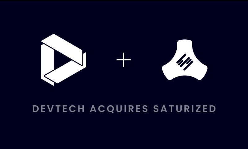
Saturized is now part of Devtech!
Check Out Our Services
Contact us
Search
Hit enter to search or ESC to close